Friday, February 18, 2011

How to use DTD in XML and DTD in HTML documents

Document type declaration (DTD) is simply a notification or instruction put with a HTML or XML to clarify the mode of rendition of the documents in browsers, the version of HTML or XML in use and for validation of the coding. Though there are other factors to use DTD in HTML and DTD in XML. In other words it is the DTD for which the html and XML files properly work. There will arise several issues if the DTD is not properly used with the two file types.
Now here we will try to point out what type of situation may arise if you hire website designer who does not know how to use DTD properly. The coders should mind just a few points mentioned below to use DTD in HTML and DTD in XML. Let’s see the things:
  • DTD in HTML and DTD in XML files are stated to identify the version of the XML or HTML in use. Without this declaration it is not possible to validate the files. All the validation systems use this process to put the mark of ‘standard verified XML or HTML’ against all the XML and html files. So the coders need to add red portion in their declaration.:
                          
                        <!DOCTYPE HTML PUBLIC "-//W3C//DTD HTML 4.01//EN"
             "http://www.w3.org/TR/html4/strict.dtd"> 
or 
            <?xml version="1.0" encoding="ISO-8859-1"?>
                <note>
                    <to>Tove</to>
                    <from>Jani</from>
                    <heading>Reminder</heading>
                    <body>Don't forget me this weekend!</body>
                </note>
  
  • If the DTD in HTML and DTD in XML files are not stated properly, the browsers would not understand the mode of XML or HTML to be shown to the viewers. When a browser does not find the DTD description then it directly shows the web pages in quirk mode, if finds out the description then shows the standard mode. In the following example follow the red marked area:
        
                <!DOCTYPE html PUBLIC "-//W3C//DTD HTML 4.01//EN"
                 "http://www.w3.org/TR/html4/strict.dtd">
                      But look the following one
                            <!DOCTYPE html PUBLIC>

  • Finding only the “public” note the browsers have to render the webpage in quirk mode (a display of web page in older version of a browser for finding DTD in HTML and DTD in XML files.  It is because the coding is not compiling with the latest validation updates provided to current browser version).
  • Suppose the client browser does not support the latest updated CSS formats you have used in your coding, what would be the display or how will you be able to show the web pages in proper condition on those browsers? Answer is very simple use “transitional” mode of coding. But if the case is otherwise the mode of DTD in HTML and DTD in XML files will be “strict”. See the coding below:

<!DOCTYPE HTML PUBLIC
                                                "-//W3C//DTD HTML 4.01 Transitional//EN"
                                                 "http://www.w3.org/TR/html4/loose.dtd">
            Or simply 
           <!DOCTYPE HTML PUBLIC
                                               "-//W3C//DTD HTML 4.01//EN"
                                               "http://www.w3.org/TR/html4/strict.dtd">

  • Now there may be some cases when you need to code or use DTD in HTML and DTD in XML files for your private view. The web pages will be visible in your system only. How would you stop the public view of those pages? The answer is very simple use “system” keyword in the coding, instead of “Public”. Look at the code below:
                    
                    <?xml version="1.0" encoding="ISO-8859-1"?>
                    <!DOCTYPE note SYSTEM "Note.dtd">
                    <note>
                        <to>Tove</to>
                        <from>Jani</from>
                        <heading>Reminder</heading>
                        <body>Don't forget me this weekend!</body>
                    </note>

If you write “public” at the place of the “system” the pages will be visible to the world. So DTD in HTML and DTD in XML files has to carefully state if the pages are to be viewed by public or not. A small mistake may disclose huge confidential matters to the world.
  • Without the proper DTD in HTML and DTD in XML files the page elements may not come in display. Particularly in the XML files DTD are the building blocks to structure the legal elements. If there is any mistake the complete coding will be useless. On the other hands many a times XML data is shared within various groups. In such cases if common DTD is not present, sharing will not be possible.

However in this way you may have understood how to use the DTD in HTML and DTD in XML properly. There are many other document type declarations for proper functioning of the XML and the HTML files. I have only tried to exemplify the few ways to use it. But here I must tell you one thing for sure, there are many coders who do not perform these tasks or take this ways to make the web pages perfectly functioning in all the browsers. As a freelance graphic designer, I never feel any lethargy to make the DTD in HTML and DTD in XML perfect for all my client sites.  I know how to make my clients satisfied with best of design and development. Hope you find the best coding for your web building purposes! 

Friday, February 11, 2011

What is cross browser dhtml

We more or less no what is Dynamic HTML (DHTML). Simply to give the plain HTML the interactive attitude the developers use DHTML. And really it has bought life to the HTML. At the same time there are some issues for which dhtml do not perform well across all the browsers. Especially the problem of cross browser compatibility of the dhtml occurs in the "Netscape Navigator" (NS) and "Internet Explorer" (IE). Actually the dhtml is a coding that works for the document object model (DOM) manipulation in the object oriented coding structuring. But it has gone really a headache for the developers to make the dhtml compatible in cross browser platforms (NS and IE). But it does not really mean that the developers are going to end up sacrificing to the issue – they have invented the cross browser dhtml coding with which their dhtml can nicely work on all the browsers.

Now here we are going to see what the purpose of cross browser dhtml is! Rather as a freelance graphic designer I will try to venture how the dhtml is made cross browser compatible in plain language. Let us see the things in a non technical language:

  • Adapting to the specific DOM for all the browser platforms is a great issue. We all know that DOM is the key for modifying an object‘s property or triggering a specific behavior. This is a no issue for the developers to code in dhtml. But eventually it is found that the NS and IE have developed some specific DOM structure to integrate into their browsers. Foe example the coding to comply with the IFRAME model for the IE is not supported in NS. So what is going to be the solution - cross browser dhtml. Developers simply code their dhtml for both browsers.
  • It may be the case that developers have to use two separate dhtml pages to comply with the NS and IE. This process of cross browser dhtml coding is known as creation of "forking page". The client (browser) side when requests as NS it pulls the code for it and same way it shows specific dhtml code when requested from IE. The compatibility issue is more or less solved in this way.
  • Another way of creating cross browser dhtml is through amalgamation of the requirements for NS and IE. In this process developers create a coding structure that contains the contingencies for both the browsers. This is a code which works as relevant when particular browser request is got. The importance of using this type of dhtml is nothing but the light weight coding. At the same time the developers do not have to update their dhtml files also.
  • To make the cross browser dhtml situation the developers also use syntax patching or the meta dhtml creation process. In this process a ‘fork page’ is used at the beginning of a the dhtml structure which creates common library. In other words a patch up work is done atop the syntax structure of the DOM language. Simply meta dhtml is simple building blocks from which cross browser dhtml can be constructed.
  • To make the cross browser dhtml situation developers use the meta function library. This is nothing but a set of functions all of which operates separately on the basis of particular meta language principles that make the dhtml cross browser compatible. The useful part of this is very much interesting. Depending on this functional library no incompatible situation occurs as the library is huge to support almost all the issues.

Hope you have understood what is cross browser dhtml and how the developers have gone their all out to make the dhtml coding compatible to all the browsers. There are other processes in use for making dhtml working for all the browsers. I have tried to show you only five points that are hugely effective in this purpose. At the same time I must tell you that no specific example is cited simply to make the reading a normal one for all the reader who feel little uneasy when reading with technical citations. So when you hire website designer and web developer, do care and ask how will be the coding of the web pages. Do they know how to tackle the cross browser dhtml situation? I have told you to ask the designers as they do have a helping part in making the web pages compatible in several cross browser platforms. However in my case, as a freelance graphic designer, I never stop coding the web pages of my client cross browser dhtml compatible for highest performance in all the browers! At least I help my client in this regard up to my level best.

Friday, February 4, 2011

Colocation rack space - pros and cons

For a website, hosting is very important. If you have a very small website then there is no need to think so deeply about the hosting services. But if you have larger business type, you have to think twice on choosing hosting service for you. There are many types of hosting available in the market - colocation rack space based hosting is one of such. In plain words this particular type of hosting is a freedom to the user – physical rack space, software and maintenance is yours. But you house to a reliable second party and take the broadband connection from them with guaranteed undisrupted power supply. However in colocation rack space use, there are some disadvantages that deviates the users or the customers to select this type of hosting services!

I have found that people get little confused to select the type of web hosting after they have selected or completed the process to hire website designer and the developers. To make the things little clear to you let us have a look on some pros (advantages) and cons (disadvantages) of colocation rack space hosting:

  • There are some cases when it is necessary that you want total control of your hosting to keep complete confidentiality of things in your hand. Then it is always better that you go for colocation rack space. Even you get the exact hardware and software as per your requirements.
  • It is always necessary that your hosting service is always available with guarantee. There should not be any excuse of power cut, failure of broadband connectivity or limitation of bandwidth. If you choose colocation rack space hosting, your hosting partner will assure you these things with power backups, 3 tier broadband connection and unlimited bandwidth. You feel relaxed.
  • Colocation rack space hosting not highly scalable; it is because it is not possible to improve the hardware or the software as and when required. Due to remote location and fewer number of service providers the maintenance becomes a headache. You always should keep your server with excessive resources. Besides that the service providers may not take the responsibility to even reboot the server in need.
  • Colocation rack space hosting is not for the inexperienced, newcomers. It can be that you are plunging in the online business with no knowledge in the hosting matters or may know the things but not well experienced. If the either of the case matches with you, this type of hosting is not for your business as you may not completely use and maintain it.
  • One of the setbacks that have pushed the colocation rack space hosting on the back seat is high expenses. First of all you need a dedicated team to manage it. Even your team may need to travel to the location of the physical server. Otherwise you have to pay extra to the service provider to maintain your server.

Anyways, you may have understood what are the primary advantages and disadvantages of colocation rack space hosting service. You may see that on average the points are against the use of this service! But does it mean people are not using this service! Certainly not! Today sometimes even working as a freelance graphic designer I face situations when my customers want advice about most reliable hosting. They feel sad that they are not capable of going for collocation racks pace due to shortfall of budget, but I tell them about the new service “managed colocation rack space”. With this new service you can simply use all the top benefits of this hosting service within your afford. Whatever cost effective the other hosting seem to us, unlimited bandwidths at low cost and constant availability of all resources are hardly 100% present in those services.

Friday, January 28, 2011

A new era in web designing

Gone are the days when the web pages used to be designed for showing the information this ways or that! Now we see new web designing trends or methods are coming in front of our eyes! Whether it is the structure, use of tools, medium of display or the nature of interaction, web design has gone admirable changes to make it more acceptable and striking to users! Actually the thought behind web page designing has gone upside down – now the motto is to convey the message and gain return on investments by any means.

Anyways, here we may have a look on a few aspects that has been giving web designing ever new lease of life. In other words the designers are trying to survive against the increasing and ever changing demands from the users and the site owners. At least when people seek and find out a freelance graphic designer like me, the first thing their demand is - what is new with you to offer? Let’s see the things:

  • The structural look of the web pages has gone huge change. The latest trends of web designing are driven to break all the conventions. No way are the three column structures bound to be there! Now designs are purpose oriented or simply to attract the eyes of the visitors. For example we may find out a huge header and small footer or embossed design reflecting the printed effect. All the icons and logos are bold and glossy!
  • To create ever effective web designing, the designers are ever innovative to try with new design tools. They want to create designs fast, effective and prefect. And in making the designs truly perfect new design tools (Firebugs, fireworks or panic coda) have come up in use. For example slicing and dicing images to create PDF with clickable component in light weight Fireworks is just amazing.
  • Now web pages are not only designed for the desktop, laptops or other computer types! Browsing webpage has entered into mobile phones. Now web pages are specially designed to fit in mobile phone browsing. Some websites even have two separate versions of websites. We find trimmed texts, images, graphics and animations are what designers aim to create mobile versions of web pages.
  • Now the web designing has become interactive in true sense. With the evolvement of web 3.0 technology – the mantra of which is to interact and present what the user is looking for – designers are designing to match this technology. The 3D or animated characters, navigations are designed to let the users feel ease and at home. Even structuring the designs for "augmented reality" is cared by the designers.

The above are only the four aspects of web designing that has come up with the changing taste of the era. There are so many other things that have come up with this era and its users. But remember one thing for sure, you as the site owner, never should go for anything new that does not suit the purpose of your business. Actually you should be properly guided by the experienced and expert designers about your web designing requirements and the trend of this new era. Again you have to be initially careful when you hire website designer or a freelancer to design your site. Carefully look out for their web designing portfolio and you will understand if they are keeping up with the changing of the era or not. Hope you will select the right designer for you!

Friday, January 14, 2011

Custom error page - do's and don'ts

We all know why the error pages occur.Apparently this may look a simple matter, especially if you are newbie in handling the matters of your website. Plainly speaking, error pages does matter. Particularly the most common error page is the 404 which comes in case there is any broken link, unidentified deleted page or page with a misspelled URL. Whatever the case may be, there has to be proper reply to the user query. Here is the use of a customized 404 page.

Now there may be a question how should be the look of the custom error page? You may also ask what should be there in a customized 404 page when you hire website designer to know the level of efficiency he or she has. Anyways, let us have a look on the matter.

  • Never let your visitors feel irritated with junk scripts rather state them in clean and clear language that the requested page is not found. Custom error page should clearly say what the reason of the error is. The user should understand that the result against their query is not found through a simple customized 404 page.
  • The custom error page has to be designed just like the other pages. It is sometimes found that the 404 pages are very dull in look and does not fit to the overall design with the site. Remember you are to show the customized 404 page in a way that user feel it no way boring or something irrelevant.
  • Have you customized 404 page with only a blank message"page not found"? Make its presence relevant, put there your site map which will help the user navigate to other pages. If you can custom error page in this way, definitely the user going to stick with your site; otherwise they will never return to your site anymore. At least there should be a link to go to the sites home page.
  • When you customized 404 page, have you ensured that the pages are not indexed by the search engines? Sometimes it is found that the custom error page is left to be indexed by the search engines. This creates really bad impression to the eyes of the visitors. Simply block the page with meta tag from the web crawlers to crawl.
  • Custom error page with widgets that help to show a search box with which users can search anything within the site just staying on the page. It will certainly help the users to stay on your site.

However these are few dos and don’t about the custom error page. There may be many other things to show a customized 404 page to the users. Even today it is found that the pages are with an option to report the broken link. Visitors are politely requested to report through this type of custom error page. However the error page design is no issue to me. I have been working as a freelance graphic designer for last decade and no client of mine has any question about the customized 404 page design for their websites. You should equally take care of customized 404 page design issue and keep your visitors coming back to your site.

Wednesday, December 29, 2010

Why html code validation is important for your website

Arguably there can not be any website without HTML. But here the matter of discussion is not about creating a website without html. We are going to discuss about the html code validation. Many a time a question wonders in our mind - is there any importance of html validation, what are those? First we have to understand the meaning of validation in general. Validation is nothing but standardization. So when the question is about html validation, it is all about standardization of the html code used in any website. There are some good reasons of html code validation. I have tried to jot down few points below:
  • If a website has web pages without validated html codes, the pages become incompatible for different browsers. Browsers work on specific standards to read the html. If a webpage is not up to standards, the design is bound to break in different browsers.
  • In the case of programming, html code validation comes in use of debugging. If the codes maintain validation standards, it becomes easy to find out the bugs.
  • Validated html coding ensures compatibility of future up gradation of the html and do help in maintenance. Whatever the upper version of the html is to come, those will incorporate the present standards. And maintenance of the site gets easy.
  • Errors in the html coding prevent the search engines to crawl the web pages properly. All the crawlers follow specific standards of html code validation. If those crawlers find errors in the coding, the indexing of the site goes wrong and ranking of the pages will never be good.
  • If codes are according to html validation standards, the developers working on those get ease in the development procedure of any simple or complex website structure or the whole development.

So you could well understand why it is so important to validate the html coding of any website. Remember everything adheres to standard. Same applies to website building. Today html code validation has gone almost a mandatory part of website design and development. At least as a freelance graphic designer I never forget to validate the html code against all my designs. Moreover it boosts my confidence that I am offering something to the clients that is certainly validated or certified according to world standards.

Tuesday, November 23, 2010

How business houses influence shifts of spot light on web design trends


Oh Tom, tell me what’s the trend! 

We all know the term ‘trend’ is pretty trendy! What Mr. Tom today advises me as the latest fashion trend, I find it next day replaced by something else! Same is in practice for the web design trends! Today a huge image at the header of a web page; the next day footer is oversized! Naturally the spot light shifts its angles and falls on what is latest.

But my question is – why this shift in spot light? I know you have the answer! Let me tell you what I found. It is the instruction of the businessmen and their business perspectives. For catching the attention of the visitors to the cliché products or the services, designers throw a bucket of colors or draw few lines on a blank webpage in such a way that we have to say Wow!
Now let us see how business demands manipulate in the shift in spot light!

The wings of imagination

Web design is a matter of creativity. It is the designers who tend to set forth new web design trends. They are free to design a whale tied with a rope and being tried to be carried by little birds! But if you can spare a little of your grey matter, you can well understand how they are drawing business. It is no new matter to render forth. What I try to say here is the use of new and emerging web design trends and their use in different businesses. In short, how the designers and their use of web design trends uplift the business!

The course or the flow

Not going by an elaborated discussion about what web design trends are now in vogue, I rather like to bend the course of my discussion in a flow which will show the banks where businesses line up to pump in or out water from the current. I will discuss the use of web design for products, services and other purposes. It is going to be a touch and go about new tools and web design trends in application for web page designs eyeing the business.

Give me sandpapers!

There are quite a handful of design tools that are coming into use, for example, Javascripts, CSS3, HTML5 and so on and so forth. These tools are new brushes to paint the white canvas far better.A javascript can easily add some small effects like click menu button, pop-up window, dialogue boxes or small icons. These are the flexibilities which designers have got when the space is limited in a web page or without excessive texts many things have to be said.

With the help of CSS3, creation of rounded corners, shadow effects and designing mobile compatible web pages has got easy. The designers as if have got sandpapers to even the edges of a wooden table!
The use of RGB color and better Opacity is also coming in action to give web page design a better and distinct look. Sometimes water color effects and every time clear illustration give better look to the web pages.

HTML5 is the latest version of HTML language and it is still in the development process. It provides several options like drag and drop of any image and embedding videos etc. Soon we will see its massive use, no sooner all the browsers accepts it.

The common factors

Some of the latest web design trends are so much useful that those may be used for all type of web page designs. Actually it is all about user friendliness and attraction.The design perspective has got a change. Formerly the look used to show simply the products or the services. But now if a product, say wine, is to be shown there has to be design effects. Same is the case for depicting services, say hotel industry, the designers are showing designs of suits in such a way that the viewers get impressed with the first look. Web pages are no different!

Interactive web design trends for better feel. The designers are trying to provide scope for making the designs interactive, say horizontal menu or the social media navigation buttons. These help the visitor to navigate fast. Even key navigation to provide keyboard shortcuts has been applied. And the use of letterpress for text or text links really gives feel in designs. More the user gets opportunity to interact, more chances increases for business!

It’s all about presenting products!

The designers are instructed to give boost to the presentation of the products. And they are showing web design trends that are simply awesome in having impact on viewers mind! Now we are going to have a glance on those web design trends.

Rich and strong typographic effects: Typically to show the offers or the ingredients of any product the text effects are must. And to produce that kind of text effect, designers have started to play with each letter, word or number. We find web pages designed with colorful effects and huge letter or word size, as we find in word art or the same!

Model or light box and slide show: When web pages are designed for any vendor of products, the main purpose of the website is to sell the products. Suppose a visitor want to have a close look at his or her selected product, he or she will come across the light box effect that only highlight the product in much better way. At the same time to view the group of products a slide show effect is just what a visitor will ask. These web design trends are nowadays hugely in demand.

Over sized logo/header and one page layout: A website is created to market and brand any company and its product internationally. So it is natural that the web pages have to highlight the name and the logo of any company in prominent way. So the designers start to use oversized logo or the header, designed in a way that the name of the company is well highlighted and leaves a great effect in the mind of the visitors. The companies liked these web design trends and those have got popular enough. And some companies want to develop sites for their unique products. In that particular case designers have created one of the unique web design trends – one page layout where in a single web page customers nicely view the products.

Intro box, text shadow and thumbnails: For better focus on information of products and to give products liveliness, the designers have started using intro box and text shadows. With the help of intro box a product is better highlighted to the users whereas shadows make every product lively. And the proper use of thumbnails shows many products at a time. The businessmen like this type of web design trends.

Minimalism and massive white space: Sometimes less effort earns maximum result. Designers used this theory in designing the web pages. They have started to grow two effective web design trends- minimum effects and maximum white space. These particular trends are effective as people sometimes get bored to see too many texts, images. Similarly blank spaces or maximum white spaces soothe the eyes. And in such spaces a product with little description is sure to catch attraction.

Please visit again!

There are thousands of service providers. They are eager to pursue the visitors to avail their services. So web designers have began to grow some web design trends that are going to help the service providers to gain a strong online presence. Now we may have a little journey about the web design trends developed with an eye to serve the purpose of the service providers.

Magazine layout:  An important part of any service industry is all about getting information about any service. With this idea in mind designers have taken to grow one of the typical and really catchy web design trends – magazine layout. In this type of layouts, designers place information as we find in news dailies. Beautiful descriptions of services come to visitor’s sight as if they are reading news with headlines. This trend is gaining popularity fast.

Print design effects: The designers are ever to pull anything new and unique. After all, they are setters of new web design trends! They have introduced web pages with print effects. The effects are so embossed that visitors feel to see printed catalogues or brochures. The trend attracts the user to read and know about the services.

Media blocks: The designers have infused a new trend in web page designing – use of media blocks. With this block the services can easily be given maximized attention. A video or the like can have superb effect on the visitors mind.

PNG and textured background effect: A few services need to show some special effects. And for those cases the designers have introduced one of the web design trends of using PNG files or different types of textures to be set as backgrounds. This really has a deep impact on the visitors mind.

Organic layout: In this type of design the designers use different organic shapes to draw attention of the users. Most of the times it is found that this trend is for excuses against faulty services. We can see social networking sites using this type of web design trends, when for over load to their servers they cannot provide service. They apologize to the user in this type of interesting and funny way. There are other fantastic uses of this trend also.

Slab typefaces and font replacement:  For few services some different attitude comes in demand. These two are very much unique web design trends from the rest. In these matters the web pages use slab typefaces (all capital letters) in texts or unusual fonts in body texts. Designers intentionally use fonts that are not used in common web page designing. These texts certainly give extra attention to the service headings and the like.

Retro, sketch and handwriting effects: The web design trends that nowadays coming into great effects are retro or the designs with vintage art look; sketching effects; and the handwriting effects. In retro style the whole design looks as if painting of vintage artifacts. This type of designs are used for heritage related industries or services.

The sketch design is also used for art related service industries. These types of designs impose the natural and familiar touch to the eyes of the visitors and communicate the purpose plainly. Similar effect comes from designs with handwriting effects. Websites related with education or such types of industries use these web design trends to grab emotional attraction of the visitors.
    
Excuse me please!

There are some industries that cannot be categories as typical product or service based. So what web design trends those going to adapt to become popular? I am talking about the entertainment and similar industries. As in the entertainment industry you get both services and products. So the businessmen could not decide what web design trends they can use for their businesses. But the designers came with some web design trends that serve typically their business and may also be used for other industries. Let’s talk about two most common web design trends used in these types of industries.

3D elements, 3D text effects: The most exciting web design trends are use of 3D elements and 3D text effects. I particularly choose to say few words about this trend separately for their use in entertainment industry. There cannot be anything more engaging than 3D effects. There are hundreds of websites, say gaming sites that use this effect for visitors. There has to be something different to entertain people. All 3D effects come for help to this industry! As I told before this effect is so much catchy that the designer have to use them for other service and product oriented business too
.
Introduction box and multicolumn: These two web design trends were designed to serve some particular industries say entertainment again, but have become web design trends for all. The introduction boxes better introduce any product or service, for example an tutorial or the like. Same way multicolumn designs came to show information in an organized way. It is found that multicolumn design is used for home page design. We all know that home page is a page to introduce a business precisely and almost as a whole. So both the web design trends -multicolumn and introduction box play vital role in designing that page.

Let’s have a ball...

It is really great to see and feel how new web design trends are coming and staring themselves in the web industry. My point of discussion was the influence of businesses on web designing. Yes, now you can see how businesses do have influence on designing in a positive way. The new web design trends could not have come in at regular intervals, had there been no influence of business people on the web designers! Necessity is the mother of all inventions.

Let there be light – spot light!

What about the spot light? Yes, the spot light ever falls on the popular and the celebrated. Here we are talking about the web design trends! What is today’s trend is for certain to get replaced by the one of tomorrow! So today may be the spot light is on Magazine layout, who knows tomorrow it could be on something related to … …! But what is for sure is the lever or control of shifting the spot light will always be in the hands of business houses. They ask the designers for new web design effects. And it is the business use of those effects that makes every designing effect a trend! Three cheers for all web design trends!

Tuesday, November 9, 2010

How to design your splash page

Today we do not walk but rush! And for this very reason we hardly can concentrate on anything more than a few minutes. So a new conception has grown that there is no need to design splash page for a website as people are going to skip it! But the things are not exactly the same. We can use splash page or the introduction page (some call it jump page) in a smart way and it can still benefit us.

Now we are going to see how to design splash page to make it most useful to achieve the ultimate goal of a website development. Before letting the things go clear to your mind, one thing I here should first clarify that the main purpose or motto to design splash page is to catch quick attention of the visitors to the best product or the service of a website with true and clever marketing attitude. Another thing that comes as a restricting factor (as public conception goes) in the path of having a splash page is its search engine unfriendliness. There are ways with which we can avoid that too.

Now let’s come to the point! I am trying to tell you how you should design splash page or what should be the instruction from you to designer in case you are willing to have a splash page for your website.
  •    First priority has to be given to portray your products and services precisely. The page should not have too many images or texts. Fewer images and text has to convey your message. This will also decrease the page load time.
  • If you use flash or 3D animation to design splash page, ensure those are not lengthy and supports multiple browsers. There has to be automated redirect to the index page if any plug-in is not available or load time exceeds than the permitted time. It is possible with programming or skip button.
  •  Try to keep something on the splash page that will not become obsolete or old after a few days. To avoid this situation try updating the splash page or provide specific links that will be options to search your products and services. Do not bore your visitors.
  • Try to design splash page with such programs or scripts that do not prevent the search engines to index your other pages of the site.  It is found that the faulty javascripts create disturbances to the search engine robots.
  •  Be creative and intelligent to design splash page. Don’t implement aggressive marketing approach. The design has to be something that interests the visitors and should have an USP.

So this should be the way of designing a splash page. When you decide to ask a web design company to design splash page, do not forget to see its experience in this matter. Remember to consult your thought of a splash page with the designers and the search engine optimizers about the smoothness or effective attitude of the page. Never try to impose the idea to the designers. The pages can earn you great result, at the same time inefficient use will lead to the failure.


As a freelance graphic designer, I have been effectively designing the splash pages for my clients. I try to catch the strain of the customer business and ask them to tell first their thoughts to my designs. So whatever the case may be at the time you hire website designer cooperate and match your thoughts with him to design splash page successfully. 

Tuesday, September 14, 2010

Difference between web 2.0 and web 3.0


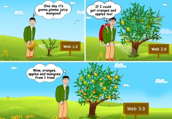
One day I bought a mango sapling and planted it in the garden of my farm house. I was too excited to get some juicy mangoes in the coming summer. I used to water the tree everyday and daydream about the mangoes! Next summer my tree was full of juicy mangos. But my expectations were also growing in leaps and bounds. Now I was hoping for some miracle and was expecting to get mangoes, oranges and apples from the same tree!!

Now do not tell me that it is something really odd or I was growing mad! I swear I can imagine something better than that too! If I could get my virtually projected girl friend and me strolling on the virtual sea shore or could easily have an opportunity to play Formula 1 finding myself as Jenson Button, inside the computer and feeling the exact sensation sitting on my computer desk then an easy grafting can bring out the result to a tree to bear such three fruits together! Well, that’s not all in my imagination. That’s the budding concept of web 3.0.

You may think –“is this guy really out of his mind?” No I am not. A few days ago I also had to scratch my head for a while just like you when one of my clients from USA asked me to design a website suitable to web 3.0. I asked him why not web 2.0? It has all that the business is in need presently! I tried to make him understand that web 2.0 is the present trend of the web design and development. Why you do not try believing that web 3.0 technologies are still a thought process inside the pipeline! He then endowed me with a great piece of advice “Don’t live for the present. Live for the future!”

He encouraged me to apply the newest of the technologies in application on website design and development. I then assured him that I never make any fuss on adapting new technologies. Rather I would be more than happy to design for a technology that relies more on the user experience, irrespective of the look or the layout!

So it is time to tell you what difference I have found between web 2.0 and web 3.0. And slowly I am developing an addiction to the later one! Want to know why? Have a look:

Gone are the days of searching for Pizza Hut or asking your friend if he likes Pizza or not!

Until 1999 the internet was taken as a useful media where anybody can make a heap of information which is supposed to be used by the people in search of such information. If you are looking for ‘Pizza’ you have to find its availability to your nearest location from the huge number of search engine result pages (by the time your appetite could have poke you out to a nearest cake shop to douse the fire with a pastry).

But in web 3.0 era you don’t even have to think of a friend who likes pizza! You got to write just that you are hungry and you want to get information on which shops you may get pizza first on the basis of your previous searches on likes and dislikes. Isn’t it like your personal assistant who knows that you like pizza when you are hungry! It is the magic of web 3.0 that uses resource description framework (RDF) and other applications which empower your machine and related software to read, analyze and produce results for you. Yahoo! search is believed to be based upon web 3.0.

Forget propagating “my template designs should be slim and trim - have a look”

This present era is all about sharing information. Hardly we can find out anybody who does not have a facebook, twitter and similar social networking accounts or profiles. This is nothing but the web 2.0 trends that asks everybody to share information either in elaborate way or in 140 characters. I can remember the rise of Blogger (in 1999) which has given the start to the exposer of expression openly. And within a few years came facebook and twitter that added sharing option to expression and the total thing got immensely popular!

But what’s about the web 3.0? Certainly it is managing the social contacts in structures to create a database which is available to the individuals in an inter-connected manner. It will help the individual to reach everything simply fast. So there is no need to be afraid that your work is going to be lost among other thousands. Machines and software are going to work for you in reaching people who are in need of exactly the service you render.

Web is going to be based on augmented reality, what about present reality?

With the advent of the smart phones and blackberry type services the web had already gone portable. The slender look of the web 2.0 had well matched with the format. But people have started to think beyond reality! The virtual reality came into being. In this world the 3D application took people to a new life where everything has gone virtual and people started to enjoy the things. The web 2.0 was the basis to introduce this. But soon the concept of virtual reality started to adopt augmented reality! And this is the introduction of another web 3.0 technology.

Now with a spectacle or camera or phone users are going to feel 3D experience for anything he or she is looking into. The users are going to feel and know anything anywhere. It encompasses from knowing any product on the go before buying or just to get information about any service. Just a desire to get anything will lead to projection of that in 3D model in front of eyes. One day it could easily happen when I am passing by you and you could easily reckon me and say you have written the article about the difference between web 2.0 and web 3.0 right?

Just wait and watch what the coming decade is to offer!!

To sum up the things I can say, let computer and software adapt the artificial intelligence. We will not even type anything in the search box of any search engine but will just think of the matter and everything will be in front of us. But till the web 3.0 comes out of the thinking pipeline web 2.0 is going to reign the World Wide Web. We have to admit that believing the reality is inevitable, rest is future! The evolution in the field of technology has bought to us the web 2.0 and one day web 3.0 will be reality. Who knows what will be the concept of web 4.0!

Saturday, September 11, 2010

How to design printer friendly web page

Today almost the whole world has gone tech-savvy. Whatever information we are looking for can be easily got from internet. That is why so many websites are there. But it does not mean the need or the use of printed information are vanished. We still have little bit ease in using printed information especially applicable for elderly people and children. In other words we should say this is why printer friendly web page is available.

Now we may say what the uses of printer friendly web page are and how to make the webpage really printable? What are the reasons web pages becomes printer unfriendly? First see why we need printable version of the web pages.

  • Use of animation and other dynamic effects cause trouble for reading and users then feel that there may be a printable version.
  • Long and informative articles or texts becomes little strenuous to read on the digital media (monitor, e-book reader).
  • It is not always possible to carry the reading devices with us. If we may have a printer friendly web page and take print, we can carry it anywhere.

Now the question comes how to make the web pages printer friendly? And it is fact that with a little care of the things I have tried to put down here will help in making any web page a printer friendly web page. Let us find few things:

  • First to increase the readability of the webpage and also to ready printer friendly web page the font size should be 12pt and font color is preferably black on white background. And the links has to be underlined to show them as links.
  • Necessarily the animation effects have to be used less or there has to be option to print pages without animation. Otherwise the print impression becomes illegible.
  • Web pages include advertisements. People taking print of any page for gathering information would like to avoid advertisements. So keep option to print the pages without advertisements. This makes user happy and web pages printer friendly web page.
  • To make a web page worthy to be printed, the height, width and margin has to be set or given option to adjust.
  • To prepare printer friendly web page is to use CSS media types, and in coding use of HTML 4.01 and above versions. These two design tools works fine to make pages printable. Avoid using too much table base coding and never use frames. It also helps in preparing print version of pages.

So now it is crystal clear that with little and easy steps, a web page can be made printer friendly. Whatever the case may be, the fundamental thing is to keep the web pages clean and worth reading. Never thrust the pages with too many animation effects or advertisement. Remember, if you first irritate the users with a clumsy look, it is going to cost you in the loose of users.

If you want to know how to keep the design intact in look and make every webpage printer friendly web page, hire website designer who knows how to design web pages both printer friendly and stunning in looks! At least as a freelance graphic designer, I always design website layouts or templates printer friendly. You may have a look at my portfolio and you could understand how templates are great in look! And yet those can be made very much printer friendly.